Styling a new brand: A short story
We had a blast helping our friends at Penelope June create the look and feel for their new, contemporary hair salon. Coordinating with the owners and their interior designer allowed us to develop a brand identity that complimented the contemporary look and feel of the space. We wanted the logo to imply a modern sense of beauty, and because it’s a new salon named after the couple’s daughter, we thought it would be cool if the icon reflected Penelope June’s initials.


Everyone was pleased with the final logo and felt it turned out well, but it doesn’t tell the whole story. A lot goes into developing a logo and this one was no exception. First there were a lot of other ideas.
We started with pencil sketches, some focused on type or hand lettering, others on ligatures, and a few with icons.

Sketches aren’t always shared with the client but some get developed further, leading to more concrete logo treatments. At this point some of the logos show promise while others just don’t land with the client. Happens every time.

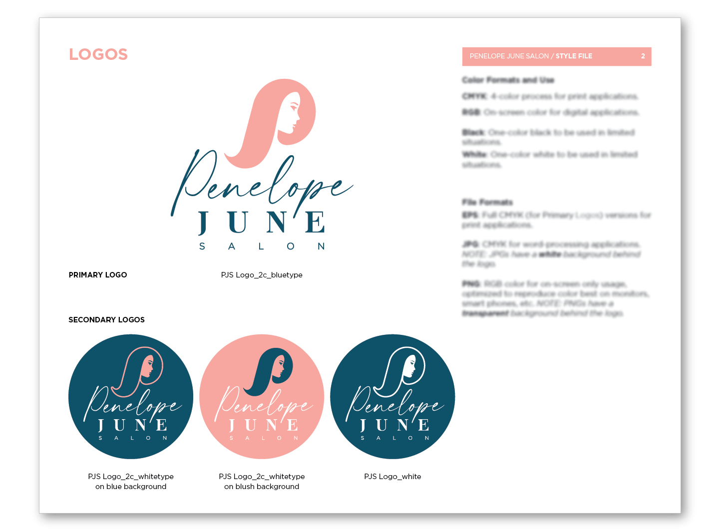
Inevitably during the creative process, something clicks, people react to an element that then gets further developed. In this case there was something about the female profile, the “PJ” ligature, and the idea of hand lettering for the logotype.

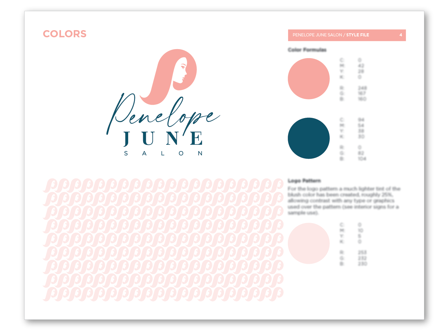
We went through a few rounds of refinement on the typography, details within the icon, and colors. Lots of colors.
The owners agreed that the typography should be stylish but still friendly, a reflection of the business (and the owners imo). They liked a “formal but approachable” look and also wanted it to appeal to women age 20 and up, their primary audience.


The final colors reflect the interior space with contemporary blue and blush tones and a pattern made from the logo offers a brand asset that works in a number of applications. These colors were coordinated with the tiles, wall coverings, and furniture in the interior design plan.


Signage for the launch was simple and a bit playful, including a “Coming Soon” sign and some interior postings. We wanted to give Penelope June a personal brand voice, like a friend, speaking to the reader in an informal and familiar way.


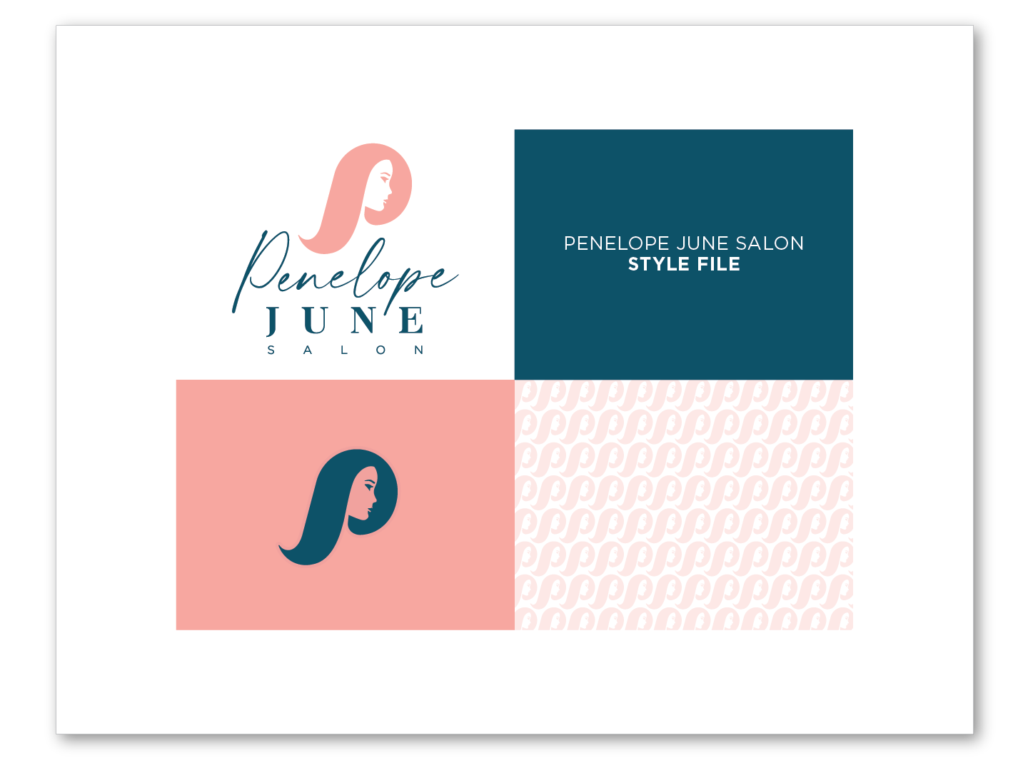
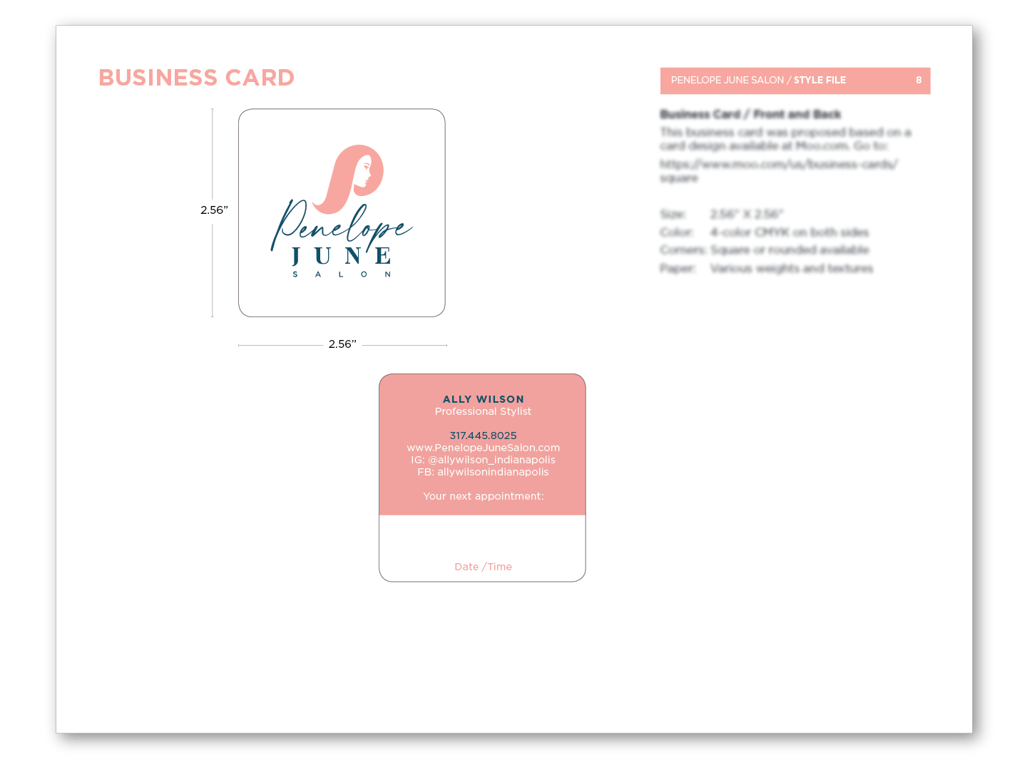
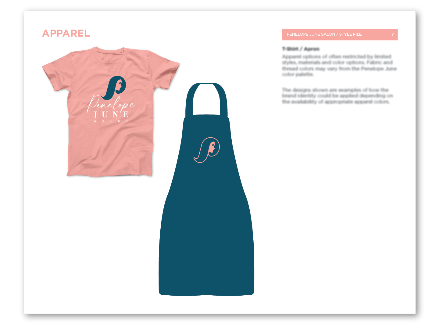
We created a brand guidelines document, called a Style File, which covers the brand basics of logo use, colors, and fonts. It also provides partners and vendors a sense of how the brand can be extended for apparel and signage in the future.
And who doesn’t love some great swag? We provided buttons with variations on the logo and brand elements to hand out to their clients at the launch. It’s great to see this small business take off with such a strong start, we know they’ll do well.

And finally, a big thanks to Ally and Dylan Wilson for their trust and partnership in this collaboration! You guys are amazing!